Featured Projects
My experience with GIS and maps is extensive and includes experience as a GIS librarian in Canada and the United States, as well as a period as the Acting Head of the Map, Data & GIS Library at Brock University. I’ve presented on the topic of GIS in many venues, including Statistics Canada, Western University and more — please see my academic CV for additional details.
I have also created maps for clients, including the National Research Council of Canada and National Defence. I created dozens of maps in Tableau dashboards, and I have also built maps from the ground up in QGIS and ArcGIS. I’m comfortable gathering information and using geodata to deliver intelligence and visualize data, and hope that some of the projects below show some of my range.
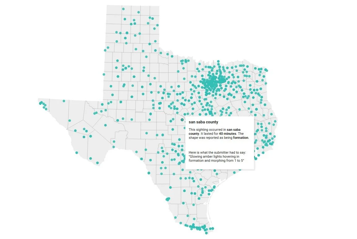
Texas UFO sightings
A quick map I created in the midst of COVID-19 lockdowns, visualizing UFO sightings in the state of Texas.
Tools used: Datawrapper, OpenRefine, Microsoft Excel
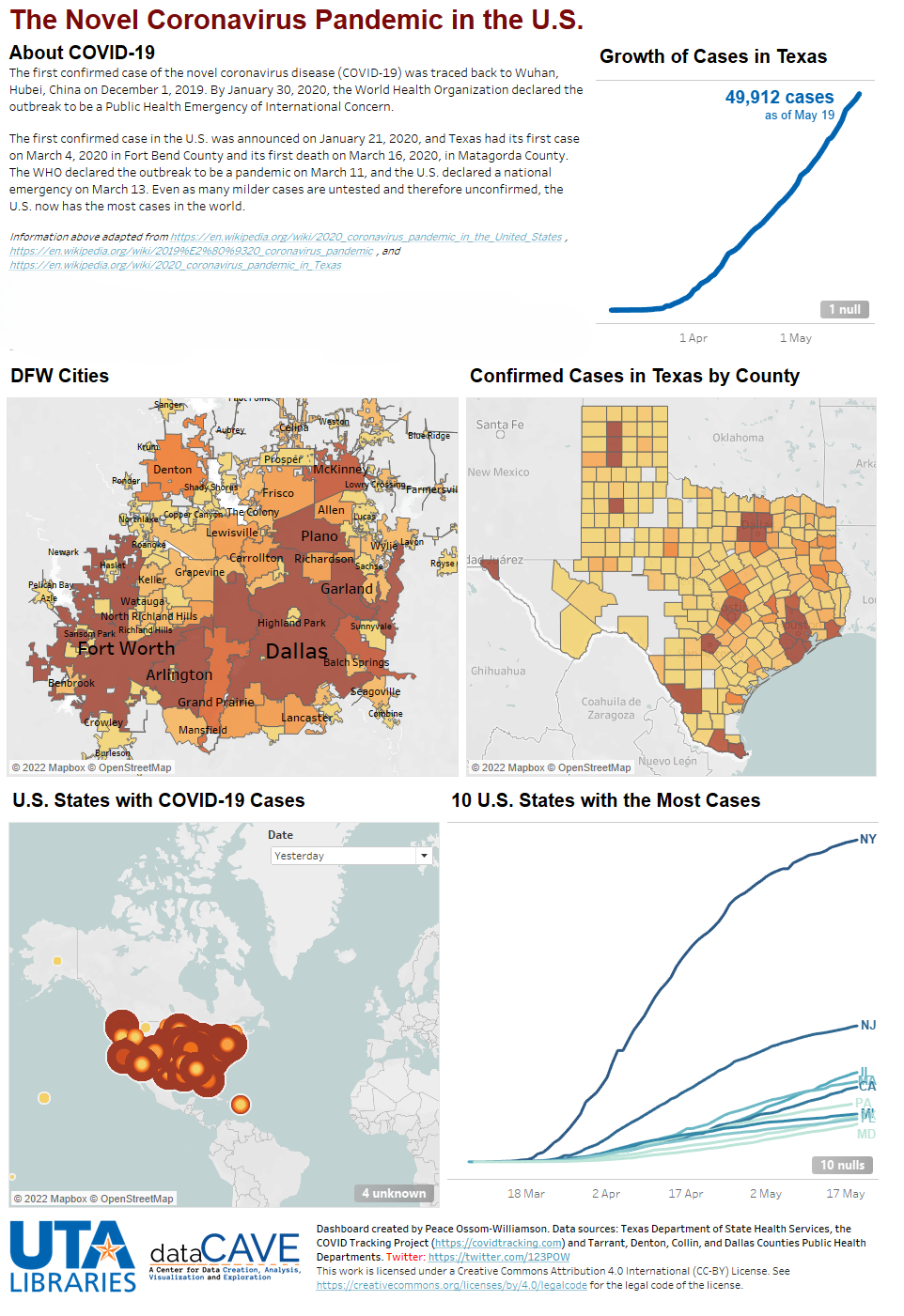
COVID-19 dashboard
In the early days of the COVID-19 pandemic, there was a need for a comprehensive dashboard tracking the spread of the virus in Texas. Data availability differed between states, and within states, in counties. This dashboard tracked and visualized statistics related to COVID-19 in the United States.
Tools used: Tableau Dashboard, Excel, OpenRefine, R
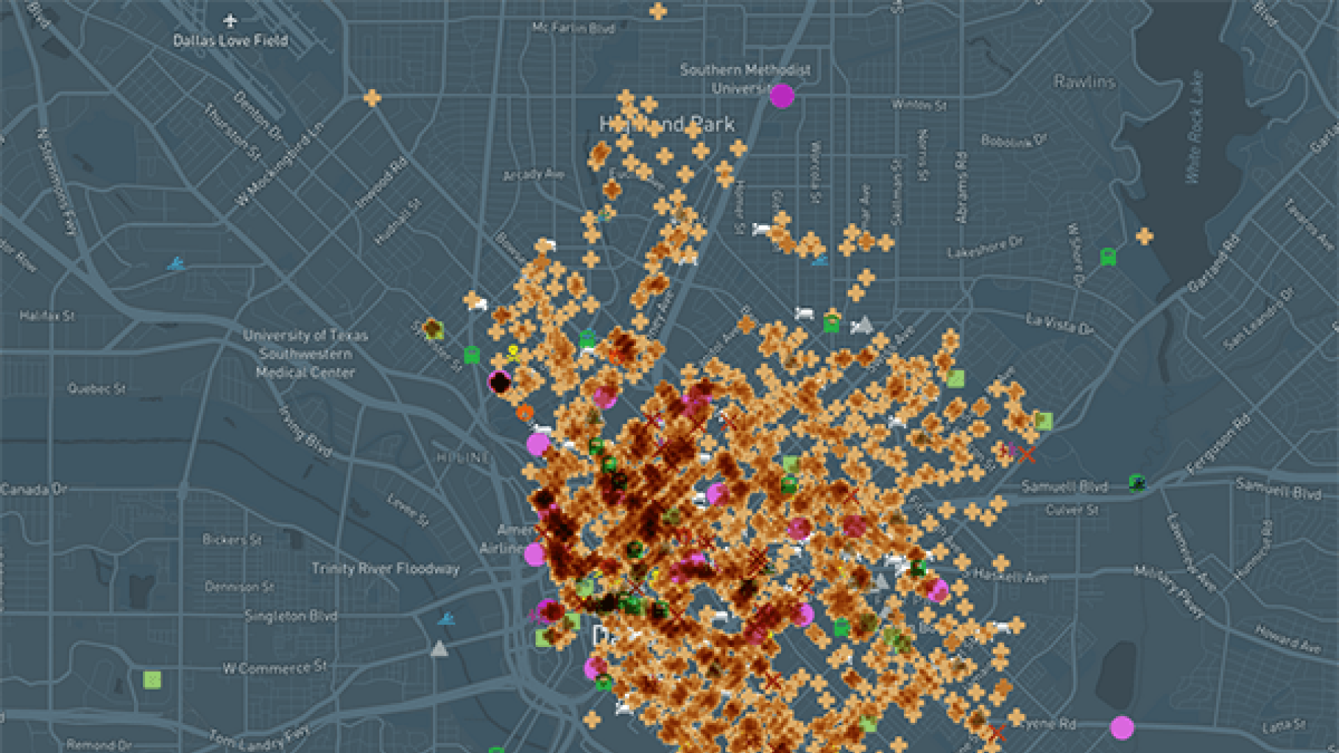
Dallas Death Map
A collaboration between a data librarian (myself) and an archivist led to the creation of this map, which tracks historical deaths in Dallas, Texas in the early 1900s.
The map is notable for focusing on deaths that occurred outside of hospitals and care homes, as deaths in these locations were both expected and typically well-documented. While it is possible to find this information via proprietary databases, there was a clear need for a platform that could enable users to search for free.
The data was collected by Priscilla Escobedo (the archivist), who obtained it from primary sources such as Texas death certificates, fire insurance maps, inquest records, newspapers and more. Following this, I cleaned and standardized the dataset, added geodata and created the interactive, searchable visualization.
This map sparked curiosity both local and national. My co-collaborator and I presented a poster about our experience at the 2020 Research Data Access and Preservation (RDAP) Summit, and the North Texas NPR affiliate, KERA, wrote about our map.
Tools used: Excel, Python, OpenRefine, SQL, Carto
Note: This map was originally hosted on Carto; however, it currently exists on Google Maps. You can find it here.